
Analytics and Operational Health
Measure success rates, durations, error types and live worker health across every workflow in one place.
These images are illustrations of the concept, not screenshots of the actual product.
Overview
Individual run records tell a team what happened once; analytics tells them what keeps happening. This concept illustrates how FluidGrids is designed to roll many executions up into measures of workflow health, break failures down by cause, and give platform administrators a live view of everything running across the fleet.
Without that roll-up, teams judge automation health by anecdote: the one failure someone noticed, or the workflow that feels slow. Questions such as which workflows carry the most volume, whether failures are rising, how quickly incidents are resolved, or whether the workspace is on track to exceed its monthly run quota stay unanswered until something breaks. The design puts those answers on dashboards filtered by time range, workflow and team.
The Analytics dashboard opens with Workflow health tiles for success rate, average execution time, failed runs and currently executing runs, each compared with the previous period. Charts show successful and failed runs over time, the top workflows by volume, the average duration trend, runs by trigger type and an error breakdown, next to a gauge of usage against the monthly quota. The Error and failure analysis view, with tabs for overview, errors, retries, SLIs and SLOs, and alerts, adds failure rate, mean time to recovery, the most common error and the share of failures recovered by retry, then charts errors by type and over time, ranks the top failing nodes and lists recent failures with a Retry link on each. The Fleet operations view, marked for super admins, tracks active runs, worker health, queue depth and error rate, lists active workflows with running counts, oldest run age and a Terminate button, and shows per-worker status, recent errors and the most executed node types.
Analytics draws on the same run records as run history and inspection, so a number on a dashboard can lead back to individual runs. It pairs with AI failure diagnosis, which turns recurring failures into proposed fixes, and with usage and billing, where the quota gauge becomes a plan decision.
What this concept shows
- Workflow health tiles for success rate, average execution time, failed runs and currently executing runs, compared with the previous period
- Filters for time range, workflow and team
- Charts of successful versus failed runs over time, top workflows by volume, duration trend and runs by trigger type
- A usage-versus-quota gauge for the monthly run allowance
- Failure rate, mean time to recovery, most common error and recovery-by-retry measures
- Errors by type, an error spike timeline against a seven-day average, and a ranked table of top failing nodes
- A recent failures feed with error-type badges and a Retry link on each entry
- A super-admin fleet view of active runs, worker health, queue depth and error rate, with per-workflow Terminate controls
How it works
- Open Analytics and set the time range, workflow and team filters.
- Review the health tiles and trend charts to spot changes in success rate, volume or duration.
- Switch to error and failure analysis to see which error types and nodes account for most failures.
- Retry recent failures from the feed, or follow a failing node back to its workflow.
- As a super admin, open Fleet operations to watch active runs, worker health and queue depth, and terminate runaway workflows.
Who it's for
- Operations and automation leads tracking workflow reliability
- Engineering managers setting and reviewing reliability targets
- Platform administrators responsible for execution capacity
- Workspace owners watching run usage against their plan quota
Illustrations
3 illustrations of this concept. Select one to view it full size.
Workflow Health Analytics Dashboard
The illustration shows the Analytics page with filters for the last 30 days, workflow and team at the top. A Workflow health row holds four tiles for success rate, average execution time, failed runs and currently executing runs, each compared with the previous 30 days. Beneath it, an area chart plots successful against failed runs day by day, and a horizontal bar chart ranks the top workflows by run volume, using sample workflows such as an order-to-cash flow and a nightly database sync. A bottom row adds an average duration trend with a hover tooltip, a donut of runs by trigger type split across webhook, schedule, API and chat, an error breakdown bar chart by cause, such as timeouts, validation, authentication and rate limits, and a gauge of runs used against the monthly quota. The design shows how a team can judge reliability and capacity from a single page.
Error and Failure Analysis
This view envisions a dedicated error and failure analysis page with tabs for Overview, Errors, Retries, SLIs and SLOs, and Alerts, the Errors tab selected, plus a date-range picker and a filter button. Tiles show failure rate, mean time to recovery, the most common error type with its share of occurrences, and the percentage of failures recovered by retry, three of them with a sparkline and a comparison with the previous week. An Errors by type bar chart ranks categories such as rate limits, authentication, timeouts, network, validation and external service errors, and an Error spike timeline plots hourly errors against a seven-day average. A Top failing nodes table lists each node, its workflow, failure count and share, last error type and time. A Recent failures feed on the right shows error badges, the workflow and run, and a Retry link on each entry, with View all failures below.
Fleet Operations for Super Admins
The Fleet Operations page carries a Super admin badge and a last-hour time filter with a refresh button. Four tiles with sparklines report active runs, healthy workers, queue depth and error rate, most of them compared with the previous hour. An Active workflows table lists sample workflows with their workflow IDs, the workspace each belongs to, a running count with a progress bar, the age of the oldest run and a red Terminate button on every row. A Worker health panel counts replicas, healthy and unhealthy workers and in-flight jobs, shows a status dot for each worker, and charts average CPU and memory. A Recent errors list groups rate limits, authentication failures, timeouts and network faults by count, message, node and time, with a type filter, and a Top nodes by executions chart ranks the most used node types above a total execution count.
Topics
- workflow analytics dashboard
- automation success rate
- workflow error analysis
- mean time to recovery for workflows
- top failing nodes
- workflow SLOs
- run volume by trigger type
- worker health monitoring
- queue depth monitoring
- automation observability
- run quota usage
Related concepts
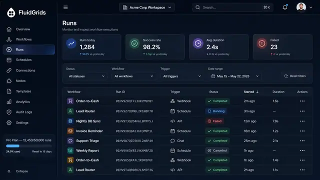
Run History, Inspection and Recovery
Follow every workflow execution node by node, then retry, resume or approve runs from a desktop or a phone.
5 illustrations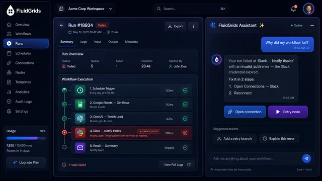
AI Failure Diagnosis and Repair
Ask why a run failed, review an AI-proposed fix as a versioned diff, and let triage group recurring failures into proposals.
3 illustrations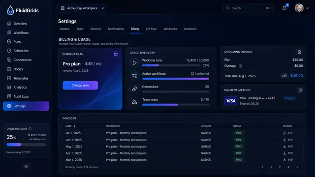
Usage, Billing and Plans
See what the workspace consumes, what the next invoice will cost, and which plan fits before a quota runs out.
2 illustrations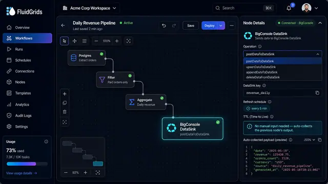
Datasinks and Live Dashboards
End a workflow with a datasink node and its output flows into a live dashboard that refreshes on a schedule.
2 illustrations